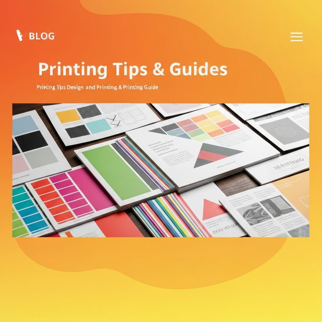
10 Essential Tips for Better Print Design
By Prinzo Team
Print design rewards preparation. A layout that looks right on screen can still print poorly if the file is not set up for the press, so it helps to work with the final size and print method in mind from the start.
Start with resolution and colour. Images should be 300 DPI at the final print size, and files are usually prepared in CMYK because that is how most presses reproduce colour. Colours on screen can look brighter than they print, so ask for a proof or sample when a brand colour is critical.
Leave bleed and safe margins. Extend backgrounds and images past the trim edge, commonly by 3 mm, and keep text and logos comfortably inside the trim so nothing is cut off. Your printer will tell you the exact values for the product.
Keep typography simple. Use one or two typefaces, make sure body text is large enough to read at arm's length, and check contrast between text and background. Convert fonts to outlines or embed them in the PDF so they do not change at the printer.
Finally, check the paper and finish. Stock weight, coating and finishes such as matte or gloss change how a design feels in the hand. Tell us what the piece is for and we can suggest options in your quote.
About the Author
Written by the Prinzo Team. Have a question about your own project? Request a quote and we will advise on options.